Effective promotional materials can elevate your business, attracting new customers while retaining the interest of existing ones. The design of these materials plays a pivotal role in how your brand communicates its values and propositions to your target audience. As you embark on creating flyers, brochures, or digital content, it’s crucial to approach the design aspect with a strategy that resonates with your brand identity.
Consider the fundamental principles of design, such as balance, contrast, and alignment, as the building blocks for your promotional items. These principles ensure that your materials are not only aesthetically appealing but also functionally effective in conveying your message. Your choice of colours, fonts, and imagery should reflect your corporate identity, creating a cohesive and memorable experience for your audience.
Remember, the ultimate goal is to make a lasting impression that prompts a response from potential clients. To achieve this, you’ll need to provide clear, engaging content alongside your visuals. This includes a compelling call to action that guides the customer towards the next step, whether it’s making a purchase, signing up for a newsletter, or following your brand on social media. Keep your messages concise and your design uncluttered to captivate your audience’s attention and encourage interaction with your business.
Understanding Your Target Audience
Before crafting your promotional materials, you need to thoroughly understand who your audience is. This understanding is paramount to ensuring your marketing messages resonate with the customers you aim to reach.
Analysing Demographics and Preferences
Your first step is assessing the demographic components of your audience, such as age, gender, income level, education, and employment. Collecting this data aids you in understanding who your customers are on a fundamental level; it reveals patterns and trends relevant to their preferences. Subsequently, you should research their preferences carefully—what styles appeal to them, which platforms they frequent, and the type of content that garners their interest. It’s this blend of demographic insights and preferences that ensures your promotional content strikes a chord with them.
Building a Customer Persona
Once you’ve gathered enough data, you can start building a customer persona—a fictional character that embodies the traits of your ideal customer. To do this accurately, include their background, challenges, and goals, all of which are instrumental in shaping the tone and focus of your promotional materials. Whether it’s a young professional looking for quick service solutions or a retiree interested in leisurely pursuits, crafting a detailed persona helps you put yourself in their shoes. By doing so, you ensure that your promotional materials are tailored to meet your customers’ specific needs and desires.
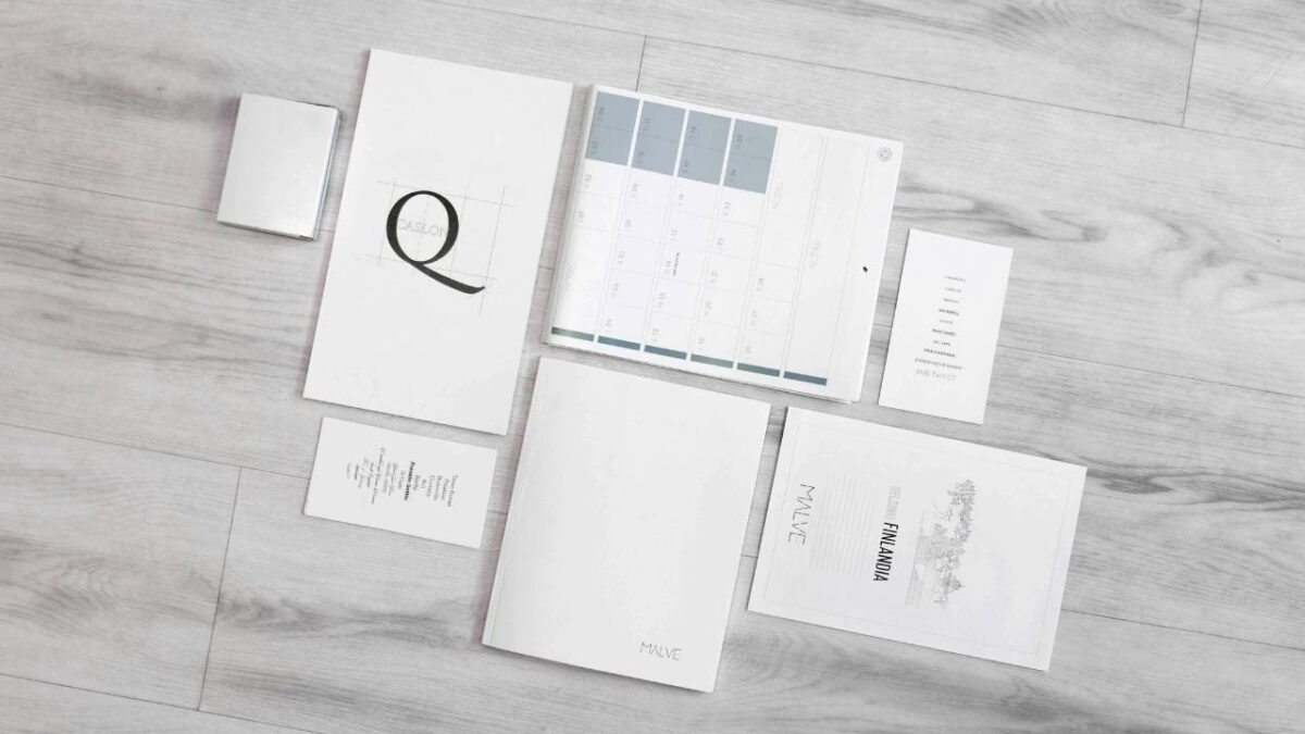
Crafting Your Brand’s Visual Identity

The impact of branding in business design is immeasurable – creating a consistent and memorable visual identity for your company is essential. This visual identity serves as the face of your business, shaping how customers perceive and interact with your brand.
Choosing the Right Colour Scheme
When you’re selecting your brand’s colour palette, it’s crucial to understand the psychology of colours and how they can convey different emotions and messages. A well-chosen colour scheme can make your promotional materials stand out, and help your brand become instantly recognisable. Think about some of the most iconic brands and their use of colour – how it reflects their industry and audience. Consider leveraging the services of companies such as Printroom Ireland, whose custom banners could be of great value when it comes to crafting your brand’s visual identity.
Incorporating Logos and Fonts
Your logo is not just a symbol; it’s a visual shorthand for your brand’s identity. It should be unique and reflect your brand’s ethos. Ensure that your logo is versatile enough to be effective in both large-format prints and smaller digital mediums. Keep in mind the scalability and how it looks in black and white versus colour.
Choosing the right font is equally important, as different fonts can communicate different tones and levels of formality. Your brand’s fonts should be legible and complement your logo and colour scheme. Consistency across all your promotional materials, from business cards to banners printed by a company like Printroom Ireland, will help solidify your brand identity in the minds of your customers. Aim for no more than two or three font varieties to maintain clarity and recognisability.
Designing High-Impact Promotional Materials
Using top print marketing materials to make something that actually stands out requires a strategic design approach. Employing high-quality images and establishing a clear visual hierarchy can ensure that your brochures, flyers, and business cards grab attention effectively.
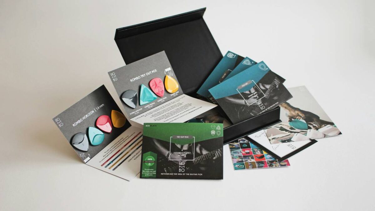
Strategic Use of Images and Graphics
Your promotional materials will draw attention when you incorporate eye-catching images and graphics. Select high-quality images that are relevant to your message and resonate with your target audience. These visuals should support the goal of your promotion and align with your brand identity. When designing business cards, use graphics that can communicate your professional image in a compact space.
For flyers and brochures, larger images can be used to tell a visual story and make an immediate impact. Ensure that your graphics have a high resolution to avoid a pixelated appearance when printed. While vivid colours can be engaging, ensure they complement each other and are suitable for your brand palette.
Implementing Effective Visual Hierarchy
Visual hierarchy is critical in guiding the viewer’s eyes through your promotional material. Begin by deciding what element you want to be the focal point; this could be your company logo, an offer, or a key message. Use scale, colour, and typography to emphasise the importance of each piece of content.
Use larger fonts and bolder colours for primary information like headlines or special offers to draw attention. For secondary information, you could use a smaller font size but keep it readable. When aligning content, remember that having enough white space can help reduce clutter and improve comprehension.
Your promotion’s details should be easily navigable, organising information in a logical order that encourages the reader to flow from one element to another. By properly implementing visual hierarchy, you ensure that your message is communicated clearly and effectively.
The Art of Persuasion in Marketing
When creating promotional materials for your business, the ability to persuade effectively is a key factor in driving customer actions. Through well-crafted messages and strategic calls to action (CTAs), you can enhance brand recognition and improve conversion rates.
Creating Engaging and Persuasive Copy
Your marketing copy should communicate your message in a way that’s clear and concise. Start by understanding your audience’s needs and desires to position your product or service as the solution they seek. Use persuasive language that conveys benefits rather than features, emphasising how your offering will positively impact the reader. Ensuring your brand’s voice is consistent across all materials fosters trust and enhances brand recognition.
Remember to be direct and confident in your word choices, avoiding complex jargon that could obscure your message. Make your value proposition unmistakable and irresistible.
Effective CTAs for Higher Conversion
A strong call to action is the bridge between your customer’s interest and their action. Your CTA should be prominently positioned, using commanding verbs that encourage immediacy, such as “Buy Now,” “Register Today,” or “Get Your Free Trial.” Infuse a sense of urgency or a time-limited offer to motivate immediate responses.
Your CTA must stand out visually as well. Contrasting colours and larger font sizes can draw attention to this vital element without overwhelming the rest of your content. The goal here is for your CTAs not just to be seen but to be acted upon, making the path to conversion as clear and straightforward as possible.
Optimising Design for Print and Digital Media

When creating promotional materials, it’s crucial to adapt your designs to function effectively across both print and digital formats, ensuring that your marketing goals are met with visual allure and practical reach.
Tailoring Designs for Various Formats
Your brochure might look stunning in print with its tactile paper and vibrant colours, but when transferred to a digital platform such as your website, these qualities can be lost. To avoid this, you should always consider the unique advantages and limitations of each medium. For instance, with a poster, the fine details are easily seen up close. But for a website, you should focus on readability and loading times. For materials like flyers, keep your design simple and direct, ensuring they can be easily adapted for social media sharing. Remember to maintain consistent branding across all formats to enhance brand recognition.
Balancing Efficacy and Aesthetic Appeal
A promotional design must charm and inform concurrently. It’s about finding that sweet spot where your material’s visual elements support your message without overwhelming it. For a brochure, this might mean using bold headers, italics for emphasis, and organising content so that your contact information stands out and is easy to locate. In digital media, integrate interactive elements like a QR code that can swiftly direct users to your website for more information. Posters should make a bold statement with a clear call to action that captures attention instantly. Whether you’re designing for print or digital, always ensure that your key message is the hero of your composition.
Conclusion
Crafting effective promotional materials plays a pivotal role in the success of your business communications. Emphasise clarity and consistency, ensuring your message resonates clearly with your intended audience. Prioritise a professional look that aligns with your brand identity to foster recognition and trust.
Stay mindful of colour schemes and make legible font choices to enhance visual appeal and readability. Utilising a harmonious balance between text and imagery will engage viewers without overwhelming them. Remember, less is often more when it comes to design elements.
Keep your content up-to-date and relevant, with calls to action that spur engagement. Always allocate time for reviewing and refining your materials. Your dedication to quality reflects in your brand’s image and can substantially influence customer perception.
In developing your promotional strategy, maintaining a considerate and approachable tone will improve client relations and help your brand feel more relatable. Your promotional materials are not just tools; they are introductions to the story of your brand. Ensure they are a testament to your commitment to excellence and customer satisfaction.